|
Below I have included the final version of the film poster for my short film 'The Unknown'. Overall, I am extremely happy with the outcome of my final product. Based on the target audience feedback I received, I was able to change my poster to fit the audience I was trying to attract, and make it link to my film. I changed the image on the front, to show clearly the contrast between the protagonist and antagonist, and I also added small features such as my name as I was the main character, as well as our company film logo and social media links so the audience are able to find out more about the film. The poster very clearly links to my short film, and I am happy with the outcome of the overall product, and how I have used synergy throughout all three products I have made. 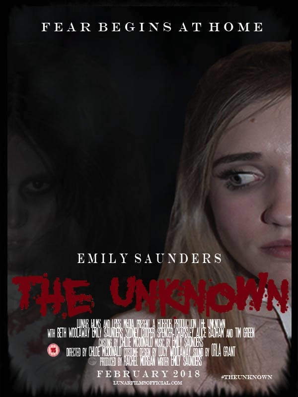
0 Comments
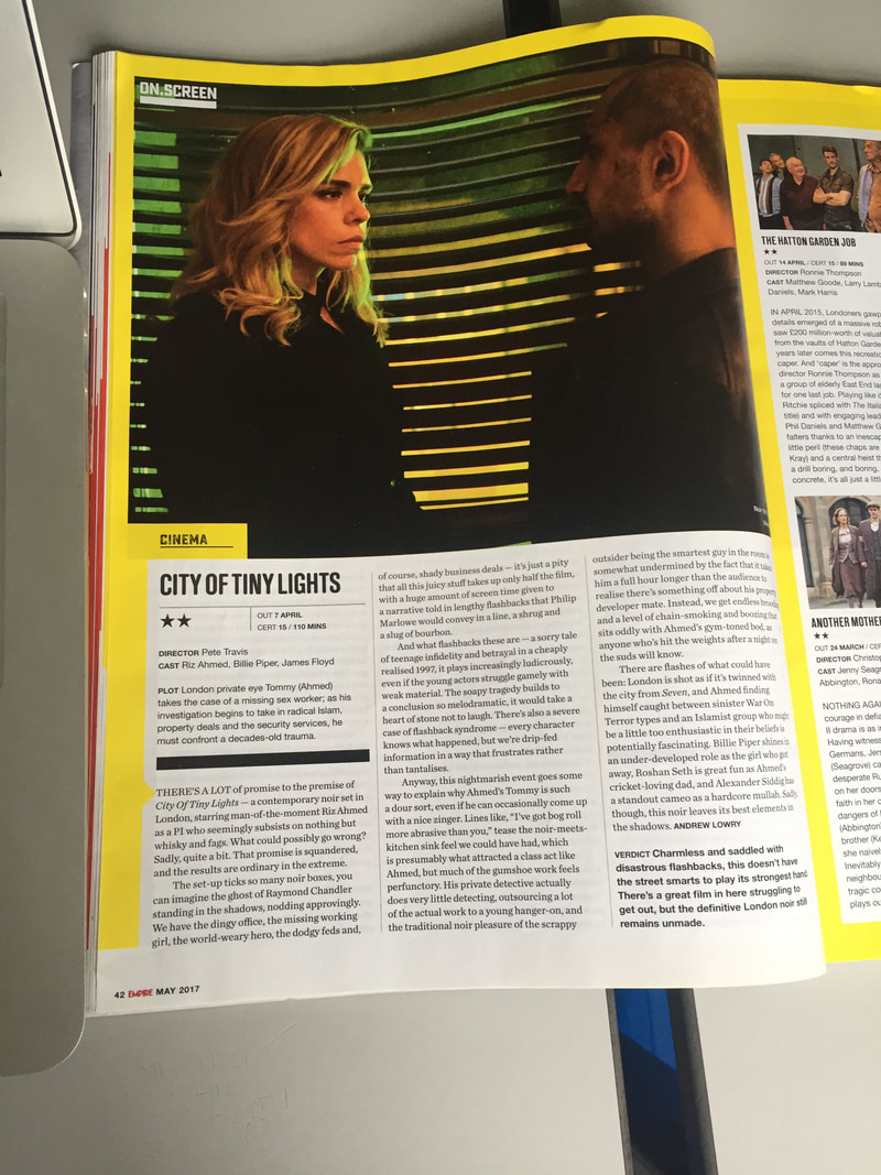
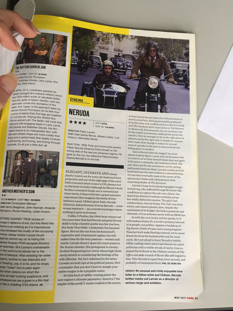
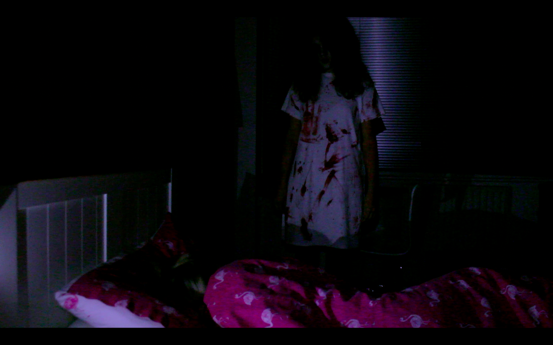
Below, I have included the final version of my film review. Based on my target audience feedback after asking opinions from various audiences. I found from the first draft of my review, the images I used didn't signify the idea of the horror genre enough and didn't stand out to the audience I wanted to attract. So I replaced and edited different images from my film which clearly represented the horror genre. These were key images throughout my film which clearly gave the genre of horror away to my targeted audience, and therefore, I felt they worked better for my final product. I also added more detail to my review, with words that made it stand out compared to just using simple words which didn't make my film sound as appealing to the audience I was able to attract. I also changed the style of my writing to make it sound more like a conversation so I wouldn't bore the readers that I was trying to attract to my final horror film. As well as this, I made the border thiner to make it look more realistic and like the Empire magazine that I had been influenced by. I also had to move the text further away from the edge of the review, to make it look more realistic, because in real magazines they don't have it right from the edge and I wanted to make my film review as realistic as I possibly could. Overall, I am extremely happy with my final film review and believe it looks professional and realistic to advertise my short film, and think I have used as many conventions possible to make it stand out to the audience that I am trying to target. I am certain I have included as much detail as possible to make it stand out and look effective among other film reviews such as the Empire. 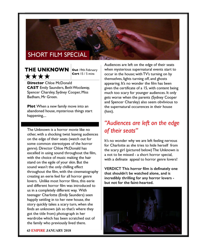 One of the ancillary products I was asked to create based on my short film was a film review about my film that would attract people to watch the film. I looked at a range of film review examples, which influenced me to create my own review. The magazine I chose to base my film review style around was the 'Empire' film magazine which is a highly popular film magazine across the UK. I chose to base the style of my review around them because I found from looking at their reviews, they were very intriguing and the style caught my eye and made me want to read the reviews. I focused on two main reviews which inspired me for the first draft of my own review and I have included it below. Even though, these reviews weren't from the same genre of my film, I really liked the style and how they had been laid out compared to other film reviews within the Empire magazine. For example, in both the reviews below, they include stills from the film which gives away the genre, and makes me question what is going to happen within the film. I also liked how each review had a rating of the film, a plot, and what the certificate of the film was. It was key details and conventions like this that stood out to me, and made me want to carry on reading the review - even if I wasn't interested in watching the film! This is the effect I wanted my film review to have on audiences, and I wanted to attract horror genre fans and film lovers to my short film. Therefore, it was important to include small details like this to make it stand out to my targeted audience.
Below, I have also included a vlog, explaining why I chose to use these specific review conventions for my own film, and the reasons behind following the empire magazine and what I liked about it. By looking at similar real media products, which I had already done as part of my research, it helped me to develop an understanding about what type of conventions I needed to include in my review, and what would make it stand out to my audience. I have discussed which ones I decided to use and why in this video, and why I think it was important in attracting the audience I was aiming for in my short horror film. MY MAGAZINE REVIEW - FIRST DRAFT Based on the reviews I looked at above, and thinking as well as playing around with what images would suit my review, I began putting together my film review based on the most important conventions and what I thought would stand out to my audience. I knew it would be important to have effective images that clearly represented the horror genre, because, it would make the review stand out more and attract people to reading it as well as wanting to see the film. I wanted people to immediately know my film was from the horror genre, just from looking at the pictures. As well as this, I thought it was important to include conventions such as star ratings and the plot of my film to grab the readers attention to the rest of the review. Based on all of these elements, I put together the first draft of my short film, which can be seen below.  One of the other ancillary tasks I had to make for the package of my short film, was a film poster which would attract my target audience to my short film. I wanted to make this stand out to meet the horror genre and reach fans of the horror genre, so I had to think very carefully about the images and conventions I used throughout my poster to ensure that this was the image I created for my film poster. I firstly had to decide what images and what characters I wanted to use on my cover to make it effective, and I also wanted to create synergy across the three products I had made, and therefore this was something I had to carefully consider when I was designing the film poster for my short film. In my first draft, the image I decided to use for the film poster was the image of the ghost that was featured throughout my short film, and also featured on the review of my other ancillary product.  One of the main aims for the creation of my poster and film review, was that it attracted my target audience to our final film. We created synergy throughout all three, to ensure it attracted the audience we wanted it to. To see if I had done this successfully, I put up a poll on my personal Instagram page with the picture of my film poster and review and asked if: 1) My film poster would attract them to watching the film 2) Would my film review make them want to read it and then go and see my film in the cinema. This allowed me to get results very quickly, due to the amount of people I had on my Instagram, and they were all within my target audience. Below I have included the screen shots of what I put on my Instagram account. In total I got nearly 200 votes for each, and this gave me a great understanding of whether or not my products were successful in the aim I had wanted to create! One of the ancillary products that I was asked to create, was a magazine review. This had to be based around my film and what I wanted the audience to perceive my film as. I looked into various real media examples and the reviews they had in popular film magazines such as the Empire. I took massive inspiration from this due to the style of the reviews and how it was laid out - and this was the example followed to help me create my own film review. As well as choosing the type of style I wanted to create for my magazine review, I had to choose suitable stills from my short film which would make the horror genre stand out in my film review. I went through and watched my short film, and took screenshots of potential shots I could use that would represent the horror genre in my film review. I have included these shots below.
One of the ancillary tasks that I had to make as part of my film package was a film poster for my short film. This was important to get right to ensure that it attracted the right audience to my short film, and to attract a wider audience overall. To create my film poster, I used an Adobe software called 'Photoshop', where I was easily able to change and manipulate my images based on how I wanted them to look. It was a long process, and something I had to keep trying and challenging myself with, as I am inexperienced in using Photoshop, and therefore, lack the skills needed to create a successful final film poster. Below I have included some of the steps that I had to take, to create the film poster that I need up making.  One of the most important conventions on my film poster that I needed to follow to make it look like a real film poster, was the typical font used on every film poster to show the people involved in the film. I got this font online, and had to download it, as it wasn't available on either word which I used, and Photoshop which I was creating my film poster on. This proved to be a problem for me, because I was unable to find the text and successfully download it. When I did eventually manage to find the exact same one and download it onto my laptop, it would only install onto word, and not Photoshop. Therefore, I had to use my initiative, and I had to type all the text I wanted onto work, and change the writing to white, before copying and pasting it to Photoshop and making it the right size for my poster. This was a much more challenging element of the poster compared to what I thought it was going to be, however, after I had created it, it looked effective and stood out on my poster.  Another important part of creating my poster, and the skill behind all of the things I made on Photoshop was the layers. Every image I added, every shape, and text, had to be a new layer and I had to change these layers when I was editing images on Photoshop. This was hard at first, as it took me a while to grasp that I had to have a layer for everything, and I struggled with moving images and objects around at first as I found it difficult to use the layers effectively. It also took me a long time to work out how to insert an image as a layer, and be able to edit it, however, once I got the idea of it, I was very quick at catching on with the rest and it allowed me to start creating my film poster effectively. 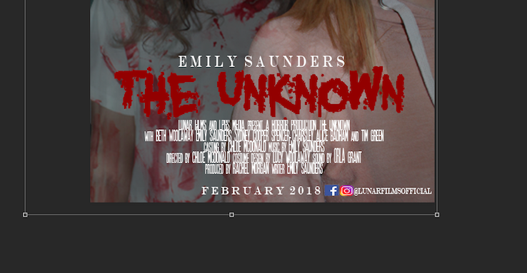 Another convention that I had to add to my film poster which was important, was the images for my film poster. When we did our photoshoot, we did it with the characters together, however, this didn't work when I was trying to edit the images. So, I chose individual group images, and cropped the characters out so I could edit them individually and make them suit the image I wanted to create for my poster. For example, on my final film poster, the image of Ivy was taken separately and edited before I added the picture of my character. However, due to the editing and use of layers and filters, I was able to make the image look like they had been taken together, and gave my poster a less edited feel, which made it look more realistic, and like the other horror film posters that I had previously looked at during my research and planning stages.  One of the other features I used on Photoshop to edit the images of on my poster individually, was changing the opacity of both photos to make them more transparent. This allowed me to create the image I wanted to create more successfully, and clearly represent the horror genre to my audience. For example, I made the opacity of the picture of my ghost 58% this made her much more transparent and darker, and represented the idea of fear and death - which is a key convention used in the horror genre, and one that is portrayed throughout my film. Overall, this made my front cover much more realistic and allowed it to stand out more to the audience as a horror genre film, which was the aim I was going for as this was the genre of my film (obviously!)  This was the overall outcome of my film poster, based on all the features I had included above, and the editing of images. My images before editing them and adding them to my poster, were normal and bright and they didn't look very eye-catching, therefore, it was important to change these so they clearly represented the horror genre to my target audience. I also added the names and font which I had downloaded to make my poster look accurate and realistic and I included this on the bottom of my film poster, just below the title of my film - as this is where they were commonly added on other film posters that I looked at and analysed during my research and planning.
|
AuthorWrite something about yourself. No need to be fancy, just an overview. ArchivesCategories |


 RSS Feed
